What is Release 3.0 (Lilypad CRM)?
Lilypad 3.0 (now Lilypad CRM) is a major upgrade to the mobile app. The entire app has been re-written on a new, modern codebase. New features have been added, and the app is more user-friendly to help sales reps get their work done more efficiently in the field.
Whether you're new or a long-time user of Lilypad, you'll easily be able to pick up the new mobile app and hit the ground running with the major features we're known for like the social wall, activities, tasks, placements, and the accounts map.
The new app, Lilypad CRM, is available in the iOS App Store and the Android Play Store!
Just go to the App Store or the Play Store and install the app! For iOS users, the app should replace your legacy Lilypad app. For legacy Android users, you can delete the old one (or keep it for the memories, if you wish :)
As always, if you have any questions, issues, or ideas for a new feature, please send us a message directly from the mobile app by going to the Side Menu > Help Me button.
Listed below are the biggest changes in Lilypad CRM. If it's not listed below, then the functionality should be similar to what was in the previous (legacy) mobile app.
New Features in Lilypad CRM
Improved Security
We've added a new layer of security to Lilypad. When you first login to the new Lilypad CRM mobile app, you'll be asked to update your password with the requirements below. Once updated, you will use your existing username (your email address) and new password to log in to the new Lilypad mobile app.
- Minimum 8 characters
- Minimum 1 capital letter
- Minimum 1 numeral
- Minimum 1 special character
A note about Lilypad Web
On Aug. 1, Lilypad Web users will access Lilypad through a new URL. This new log-in will require you to update your password, if you have not already done so (this is the same password you use with the new Lilypad CRM mobile app).
The new Web site URL is https://lilypad.app.fintech.com/. If you've updated your password, great! If not, you can do so now, and start using the new log-in URL. Update your password by logging in with your old credentials, and you will be prompted to update to a stronger password. If this does not work, tap the “Forgot password?” button.
If you have any questions, please contact lpsupport@fintech.com.
New Home Screen
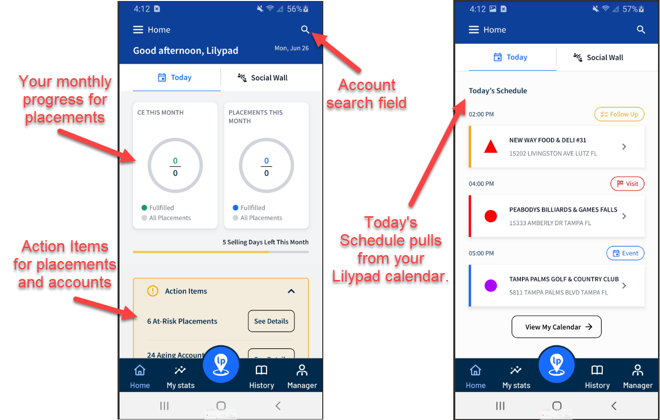
Upon logging into Lilypad CRM, you'll land on a new Home Screen with a header that includes a greeting with your name, the date, and -- most importantly -- an Account Search field so you can quickly find your accounts.
The Home Screen - Today's Schedule tab serves as a central point for critical updates, action items, and scheduled calendar items to help plan your day. You can:
- View your progress for the month
- Get alerts when issues occur or accounts have not been visited for awhile
- Get a list of today's events you've planned
Tapping each item navigates you to that area, with your information sorted for you.
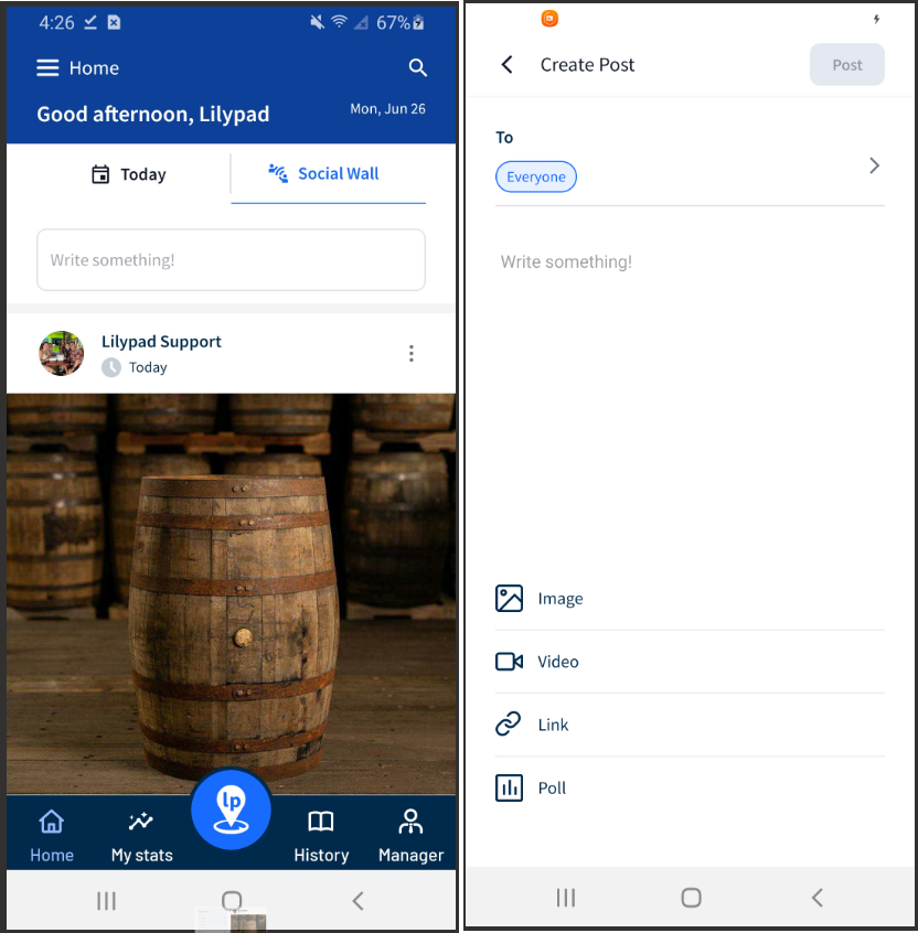
The Social Wall has its own tab on the Home Screen, right next to Today's Schedule. The Social Wall retains all of the same functionality from the previous mobile app with a new, modern look. Tap "Write something!" to start a new post. It will default to a basic text field, and the text field will become the caption to any image, video, or link post.
Activities and Tasks
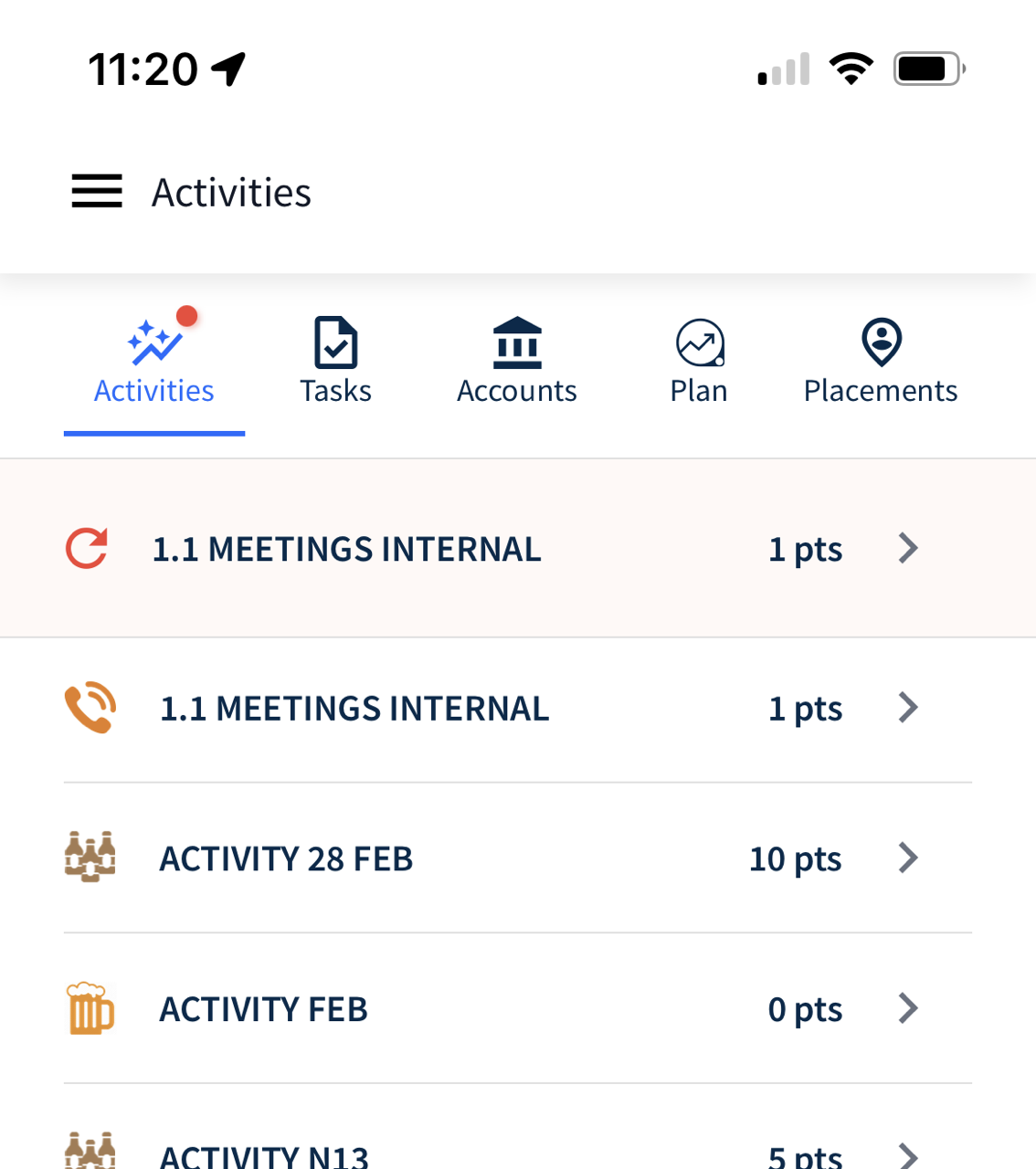
Red notification badge indicates an incomplete survey
If you're in the middle of filling out a survey (for example: an Activity) and need to back out to complete a quick Task, the main Activity tab at the top of the screen will display a red notification badge, and your incomplete activity will be highlighted in red at the top of the list of activities.
After you complete your task, you can tap on the red activity box to complete it later. The same occurs if you start a Task and need to back out to fill out a quick Activity.
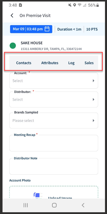
Sub Navigation buttons (formerly "quicklinks") at the top of an Activity or Task
When you start an activity or task that requires you to choose an account, the Sub Navigation buttons at the top of the survey will now take you to the same full page found on the corresponding Account Profile page tab. In the previous mobile app, tapping one of the quicklinks took you to an abbreviated version of the corresponding Account Profile page tab.
For example, when you tap the Sales sub navigation button, you can now see the new Sales screen instead of just a list of brands.
My Stats - Market Stats
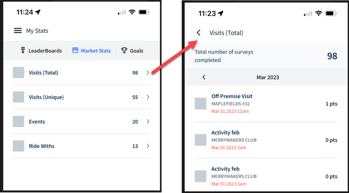
The old mobile Dashboard is now My Stats. Here, you'll find the redesigned Market Stats tab that now allows you to view more granular lists of Visits, Events, and Ride Withs for this month and previous months (in the old app, you could only see quantities for each of these items).
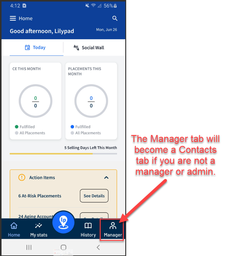
Manager/Contacts tab - lower navigation
The More tab at the bottom of the social wall from the previous app has been replaced by a Manager or Contacts tab. If your user profile in the web version of Lilypad has been setup as a manager or admin, then you will see the Manager tab in the lower navigation of the mobile app. If you are not setup as a manager or admin, then you will see the Contacts tab.
The Manager tab will take you to the More > Manager page that was in the previous app. This includes the Live, Planner, and Placements tabs.
The Contacts tab is a shortcut that takes you to the same page as Side Menu > Contacts (list of your colleagues).
Blue Pushpin
Upon logging into the new mobile app, tapping the Blue Pushpin in the lower navigation will land you on the Accounts tab. Unlike the previous app, the lower navigation (including the blue pushpin) will stay pinned to the bottom of the screen to allow easier navigation. If you have drilled into the blue pushpin and you're on either the Activities, Tasks, Plan, or Placements tab, then tapping the blue pushpin again will take you to the Accounts tab.
Account Profile Page
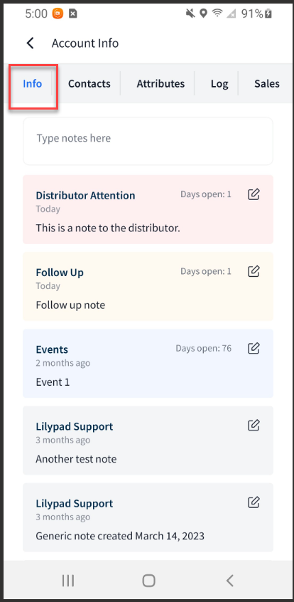
Info tab
In addition to viewing a list of manually added notes to an account profile page, notes from Plan > My Lists will also land in the Notes section of an account profile page. Notes from Plan > My Lists include Potential Placements, Follow Ups, Distributor Attention, and Events.
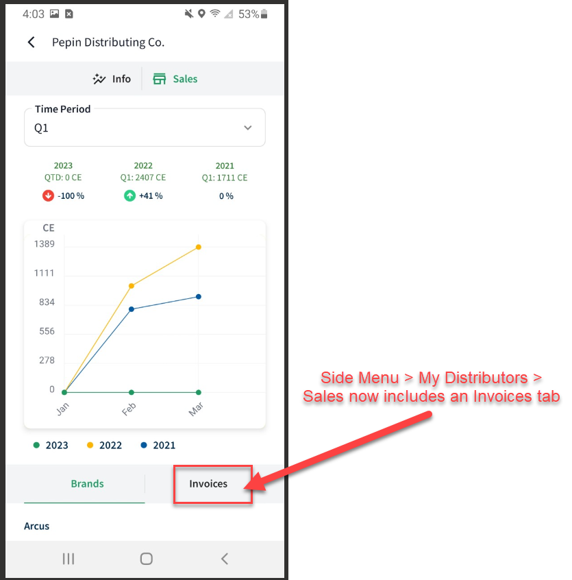
Account and Distributor Sales
The new Sales tabs for Accounts and Distributors have been redesigned with the following features:
- Both have a new Time Period dropdown that show sales comparisons between this year, last year, and the year before (for example, 2023, 2022 and 2021). You have the option to compare by entire year or by quarter.
- For Side Menu > Distributors, we've added an Invoices tab next to the Brands tab (in the old app, Distributor Invoices were found under the More > Sales tab).
Placements
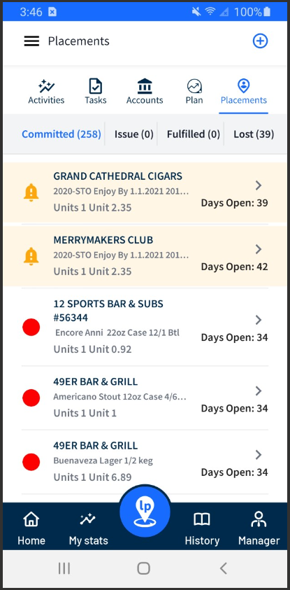
We streamlined the Placements screen by removing the Potential and Aging states.
- Potential Placements still exist under Blue Pushpin > Plan > My Lists, and the Aging placements will show in yellow under the Committed state.
- The Committed state now has two new sorting buttons that allow you to sort your list of placements from newest to oldest or oldest to newest.
- The Issue state (formerly Matched Issues) works the same way as the old app but has a more user-friendly design.
What's not (yet) in the Release
The features listed below are not yet available in the Beta release of the new mobile app. These features will be available in upcoming releases:
- Account Not Found / Can't Find an Account - under development!
- Offline Mode
- Manager tab > Analyze tab
- Manager tab > Planner tab > "All Teams" will not be an option in the Team picker
- Filters under the History tab (formerly the Journal)
- Automatic background refresh
- Side Menu > Help Me button will have limited options.
- Social Wall > Team Picker
- Social Wall > sort by Chronological/Action
- Social Wall > "Report Post" option
- Email and Push notifications
- Annual Plan report
Click the link below for full documentation on the Lilypad CRM Mobile App: